The storm may be hundreds of miles away. The useful news is that it is moving toward you faster than a horse, and the warning can now move faster still.
Weather prediction changed when observations from many places could reach one desk at nearly the same time. In the nineteenth century, the telegraph helped turn scattered temperatures, winds, and barometer readings into a picture of weather moving across a continent.
Many observers, one problem
A useful national map required observations that arrived together.
A weather observation describes one place at one time. To follow a storm, forecasters need comparable observations from a wide area before the information becomes old. Mail could carry careful records, but it could not produce a same-day continental picture.
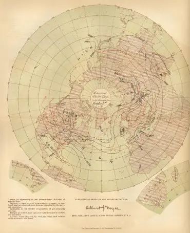
NOAA traces an early network to Smithsonian secretary Joseph Henry, who proposed using the telegraph for storm forecasting in 1848. By 1860, about 500 volunteer stations were sending daily weather reports by telegraph. The network supplied pieces of a map that could finally be assembled while the weather was still happening. The 1877 polar map shown here extends the same method across the Atlantic, gathering observations from land stations and ships into one synchronized view.
The Signal Corps begins forecasting
In 1870, weather reports became part of a national warning system.
On February 9, 1870, President Ulysses S. Grant authorized a national forecasting capability under the Secretary of War. On November 1, Brigadier General Albert J. Myer established the Army Signal Corps weather-warning network known as the Division of Telegrams and Reports for the Benefit of Commerce.
Field stations sent observations to Washington three times a day. The Signal Corps prepared forecasts and storm warnings, then distributed them to observers, railroads, and news media. Newspapers printed the bulletins, while post offices, train stations, telegraph offices, boards of trade, and chambers of commerce displayed weather information for the public.
Lines across a continent
The first federal daily maps were sparse, then quickly grew more detailed.

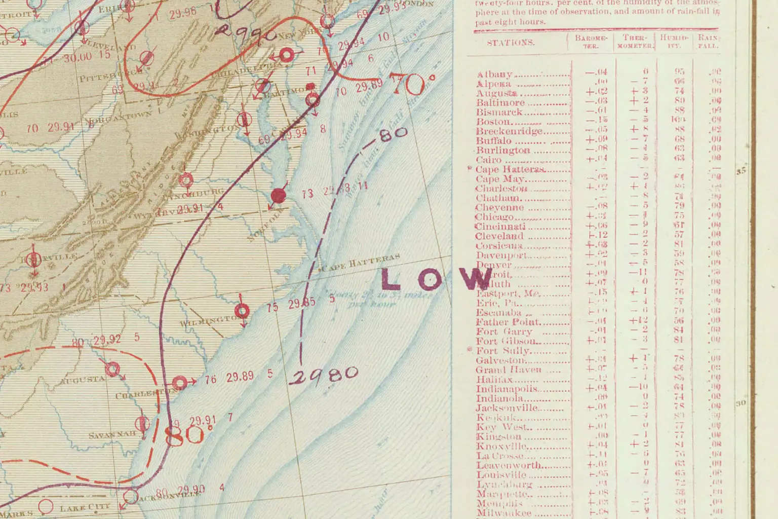
The Signal Office began publishing War Department weather maps on January 1, 1871. The earliest versions plotted temperature, barometric pressure, wind direction and speed, and general conditions for cities across the continental United States.
Tables, forecasts, isobars, and isotherms followed. Isobars connect places with the same air pressure; isotherms connect places with the same temperature. By the end of 1872, the daily map had settled into a recognizable format. The title and agency changed over time, but the work established a continuing federal series of daily weather maps.
Read an old weather map
Find the evidence a forecaster had that morning.
Open one of NOAA’s historic daily maps. Choose three cities and record the temperature, pressure, wind, or weather symbols shown there. Then trace one isobar or isotherm and describe the area it crosses.
Compare the map with a current forecast map for the same part of the country. List the information both maps provide and the information available only now, such as radar or satellite imagery. The comparison shows which questions remained steady even as the tools multiplied.
SHARE THIS WITH THE KIDS
A few things to talk about together.
- By 1860, about 500 volunteer stations were sending daily weather reports by telegraph.
- The U.S. Army Signal Corps established a national weather-warning network in 1870.
- The federal daily weather-map series began on January 1, 1871.
A FEW OF THE SOURCES BEHIND THIS PIECE
Read a little deeper
- NOAA Heritage: General Myer and the early national weather service (opens in a new tab)
- NOAA Library: History and archive of U.S. Daily Weather Maps (opens in a new tab)
- NOAA National Centers for Environmental Information: Daily Weather Maps collection (opens in a new tab)
- NOAA Library: Signal Service weather map for August 3, 1877 (opens in a new tab)